CTO Lighting
The Brief
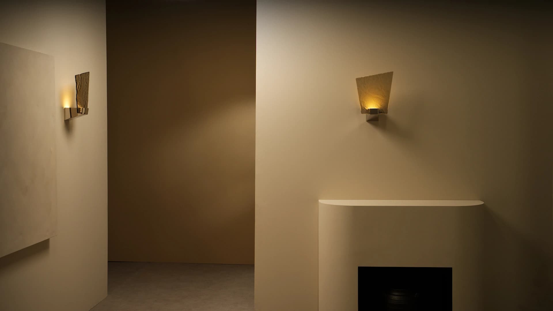
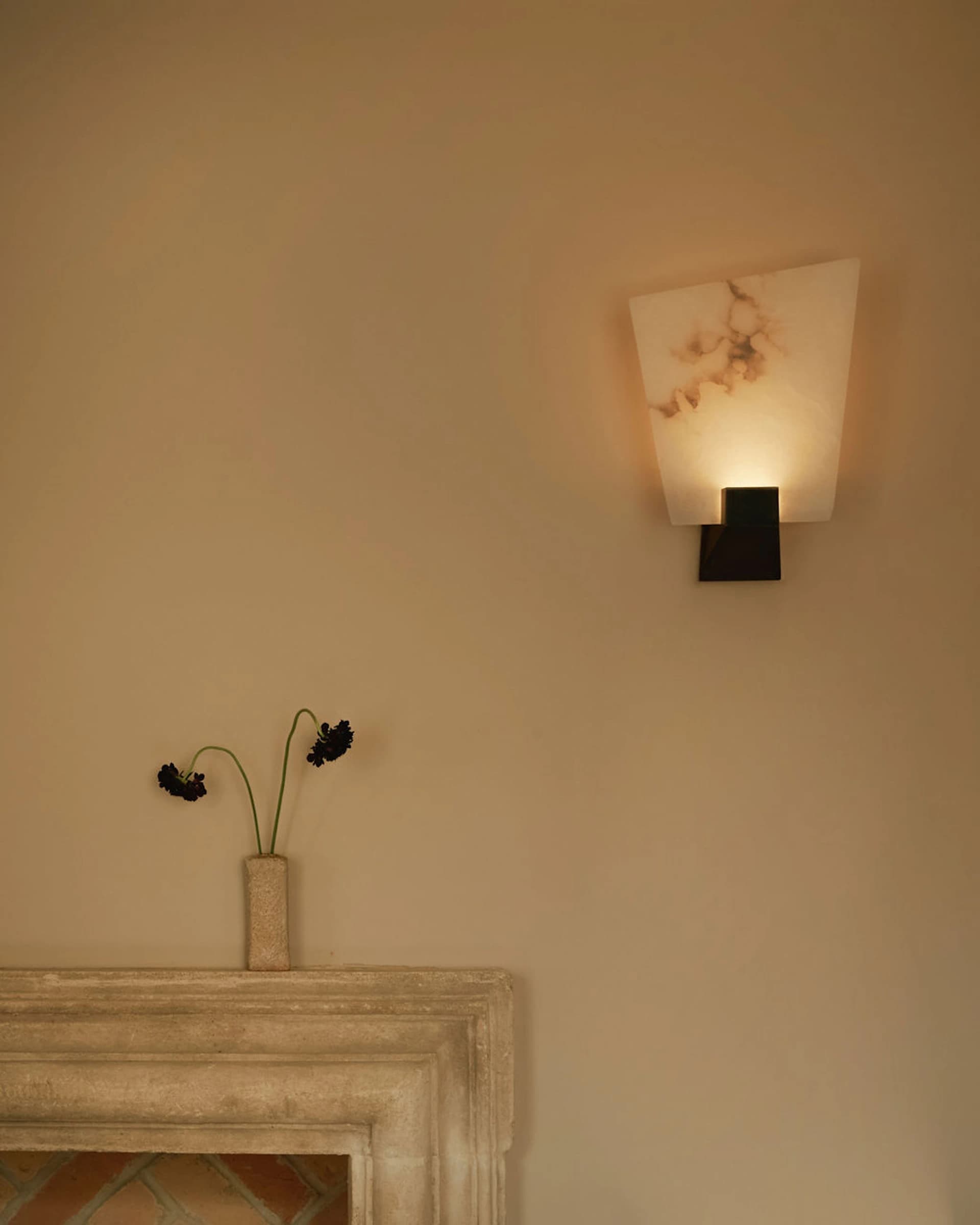
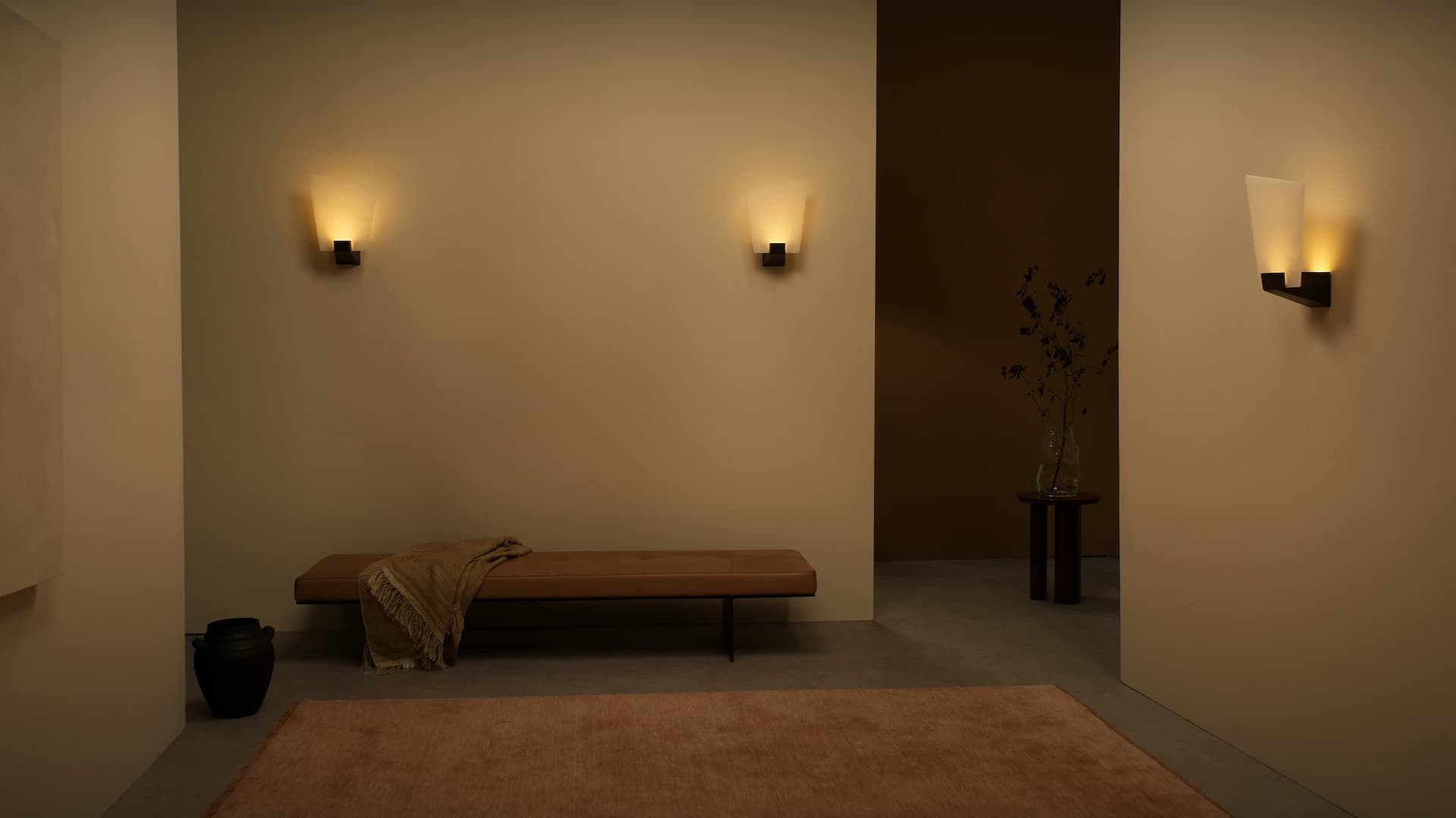
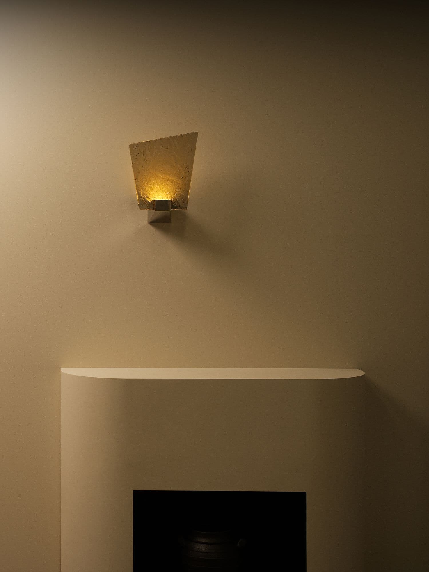
CTO Lighting required a name for a new wall light. The challenge involved naming a product for a heritage luxury brand with 25 years of carefully curated products. The light featured an angular brass base with chamfered edges paired with an asymmetric shade in honed alabaster or kiln-formed glass — sculptural and architecturally refined.
A beautiful object without a narrative — and in the luxury lighting world, the narrative is what elevates a product from a specification to a desire.
The name needed three things: provide a conceptual framework for designers and architects, align with CTO's existing naming convention, and feel worthy of a product retailing at several thousand pounds for prestigious hotels and residences.
Foundations
CTO Lighting was established in 1998 by Chris Turner (engineer trained at Arup) and Clare Turner (fashion industry background). The founding principle: luxury lighting should be handmade in England using the finest materials available.
Key characteristics:
- Hand-finished brass in satin, antique bronze, and polished nickel
- Mouth-blown glass shaped by artisans
- Honed alabaster for natural translucency
- Kiln-formed glass with subtle handmade imperfections
- 80% UK-based suppliers
- Manufacturing in Stourbridge; London showroom
- Installations in The Savoy, The Dorchester, St Pancras Renaissance Hotel, Chiltern Firehouse
In luxury interiors, names aren't labels. They're part of the experience.
Audience
Primary: Interior designers and architects specifying lighting for high-end residential and hospitality projects. They evaluate based on material quality, design integrity, and spatial composition.
Secondary: Discerning private buyers furnishing homes where every object carries intentional selection. They discover CTO through designers, the London showroom, or luxury retailers and publications.
Both audiences share sensitivity to language. In luxury interiors, names function as storytelling devices, not mere labels.
Landscape
CTO's naming convention established clear patterns:
- Natural phenomena: Nimbus, Ivy, Roc
- Architectural references: Contour, Modulo, Torres, Cubist
- Place names / proper nouns: Roma, Avalon, Jules, Columbo
- Material / sensory concepts: Lucid, Shard, Cascata
These names are evocative without being decorative — single words or short phrases that open a conceptual space without over-explaining.
Competitive context: luxury lighting competitors like Flos, Artemide, and Moooi invest heavily in naming as product storytelling. Generic or technical names would undermine CTO's market positioning.
The narrative is what elevates a product from a specification to a desire.
Strategy
The strategic foundation began with physical observation: the alabaster shade appeared as a piece of something — a section, a shard, a remnant. It looked like it had been discovered rather than manufactured.
Core concept: A precious fragment from the past — a contemporary object carrying emotional resonance of antiquity, similar to how Roman marble fragments retain beauty despite incompleteness.
This concept shaped designer and architect narrative for client presentations, elevated the materials (alabaster and kiln-formed glass as historically rooted crafts), and explained the asymmetry as inevitable rather than arbitrary.
Identity
Within CTO's architecture, Relic occupies unique emotional territory. The name suggests time and material memory — the most archaeologically resonant product name in the collection.
Characteristics:
- Warm rather than clinical tone
- Conveys reverence and preservation instinct
- Honours endurance over novelty
- Understated and material-conscious
- Confident without ostentation
- Functions practically as "Relic Wall" within the naming structure
The name doesn't describe the product. It reframes it.
Finding the name
The name functions through reframing: a wall light is a commodity. A relic is something you preserve. That single word transforms how the viewer relates to the object.
The name generated the complete conceptual language. All subsequent product communication — fragment, precious, past, elegance, preservation — flows from this naming decision.
Single word, evocative quality matching Nimbus and Shard. Material gravitas of Roc and Avalon. Distinct territory addressing time, history, and incomplete beauty.
Five letters establishing a complete conceptual framework for specification in prestigious interiors.
More case studies

Get a free Brand Strategy Snapshot
Get a taste of the strategic work we deliver, completely free. Answer a few questions and we’ll show you what most brands never figure out: your core tension, your enemy, and the point of view that makes you impossible to ignore.